WARNING
In this exercise, we'll be covering a few basic tasks in QGIS using vector data.
QGIS Basics
Creating a new project
Open QGIS and left click twice on "New Empty Project" under "Project Templates." You can also click on "Project" in the top left and select "New." Create a folder somewhere on your computer to store this exercise. This folder will be referred to as "your exercise folder." This folder will store the data downloads as well as your overall QGIS project.
What data are we using?
Lets say you are working for the City of San Diego's public health department. You have been asked to identify areas where drinking water contaminants are higher compared to the rest of the city. We can map this data in QGIS and then even style the data in many different ways. We are going to style this data by changing the color of each area to be lighter or darker depending on the percentile of contaminants found in drinking water.
What type of map this is? This is a choropleth map because we are using shaded areas to represent our (drinking water contaminants by percentile) data. You can also refer back to Types of maps.
Downloading vector data
Lets start by creating a map using vector data. This data is going to come from the website: City of San Diego Open Data Portal. You can find the exact download file inside of the "exercise_files" folder. You can also click this link or follow the instructions below to find the download through the website.
In the search for data bar type: "water san diego 6.3.2." On the left side under "View Types" select "Maps." Click on "SDG Indicator 6.3.2 Map - Drinking Water." Click "Export" in the top right and for the Export Format select "GeoJSON." Recall when we learned about the common vector data formats in the lesson: Spatial data and its types.
After downloading the file, open up another file window, and go to where your exercise folder is. Drag the download into your exercise folder.
Adding a vector layer in QGIS
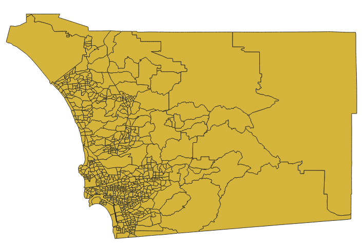
Go back to QGIS and find your file on the left side. This file should now have the GeoJSON file inside of it. Hold left click and drag the GeoJSON file and release it when under the Layers section just below. You can also right click the GeoJSON file and select "Add Layer to Project." You should now see something like this:
Navigating QGIS
By default, you should already have "Pan Map" selected. This is the hand icon towards the top of the screen. In this mode you can hold left click, and move around to see different parts of the map. Refer to the picture below:
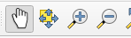
In this picture, there is also a zoom in (magnifying glass with a plus) and zoom out button (magnifying glass with a minus). You can click one of these and then left click to either zoom in or zoom out. You can also zoom in and out by either moving your mouse scroll, or using CTRL + and CTRL - if on windows. Don't forget to click back on "Pan Map" in order to move the map around again.
Plugins and saving
Next, in the bar towards the top of the screen, click "Plugins" and "Manage and Install Plugins..." In the search bar, type and install: "QuickMapServices." The author is NextGIS. Make sure it pops up on the left side under "Installed" to see if it is downloaded. You might need to restart QGIS to be able to use the plugin. Before restarting, make sure that you save the exercise. Click "Project" in the top left and "save." Select a location and choose a file name. The file should save as ".qgz."
Create a basemap layer
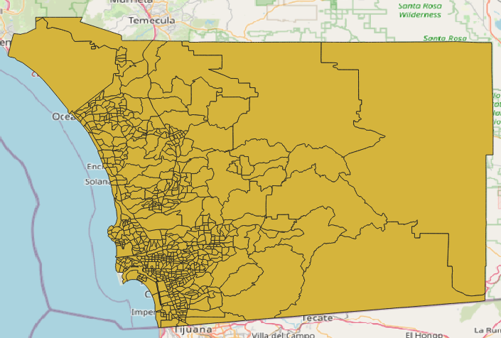
Towards the top right of the screen, hover your mouse over a few of the icons and find "QuickMapServices." It should look like this:

Click on it -> OSM -> OSM Standard.
You should now see something like this:
In the bottom right corner, you should see something like "EPSG: 4326." We can change the map projection by clicking this and select: "EPSG: 3857." This is what most maps use. Click "Apply" and "Okay."
Formatting Data
Double click your layer, it should look something like "SDG Indicator..." under "Layers" on the left side. A new window should pop up. On the left side, click "Symbology." In here you can change the color of your data, the opacity, as well as choose different icons. If you are happy with your changes, click "Apply" and then "Okay." Otherwise, just click cancel.
What type of map are we using in our exercise that shows drinking water contaminants by percentile?
Didn't get the correct answer?