WARNING
This exercise is a work in progress.
Vector and Raster data
Styling our data
Now that we have our map up and a basemap layer, we can work on making it look better. It's currently one color and it's very hard to tell how we are representing our data. Below, we are going to cover categorized data and graduated data to see how we can style our map. The drinking water percentile values are what we are going to focus on. This is because this value shows the percentile of contaminants found in drinking water. We are also going to cover how to rasterize, or change our data from vector to raster.
Categorized data
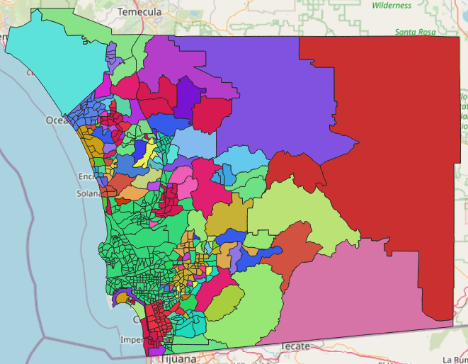
Double click your "SDG Indicator..." layer. A new window should pop up. Click "Symbology" on the left side. Towards the top there should be a drop-down menu that currently says "Single Symbol." Click this and go down to "Categorized." In here, we can color our data based on the category data or value that we select. Directly under, there is a "Value" drop-down. Click the down arrow and select "drinking_water_percentile." This will organize the selected data by color. In the lower left click "Classify."
We now see a bunch of different colors that pop up. This is because each value has its own color. We can uncheck certain values by unselecting them in the checkbox on the left side. We can also double click the one of the current colors. This will open up another window where you can change the color, opacity, etc.
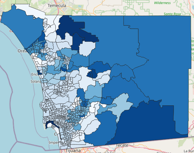
Directly under "symbol" you should see "color ramp." Click on the down arrow and change it from "Random Color Ramp" to "Blues." The "Random Color Ramp" option would not work very well for us because it will be very hard to manage and read the data. If you don't understand why, refer back to the Misleading maps lesson. Take a look below at the "Random Color Ramp" vs. "Blues."
We are going to click cancel for now. This shows you how we can color the categorized data.
Graduated data
Double click your "SDG Indicator..." layer again. Click "Symbology" on the left side. In the drop-down menu towards the top click "Graduated." If you click the "Value" drop-down nothing will pop up. This is because we need to change the data type. Click "Cancel" to get out.
Towards the top right of the screen next to "Help," click "Processing" and then "Toolbox." This should open on the right side of your screen. Search "ref" to find "Refactor fields" and double click on it. This will open a new window and look for "drinking_water_percentile" under the "Name" column. The "Type" of it should say "Text (string)." Click it and change it to "Decimal (double)." Then, click "Run."
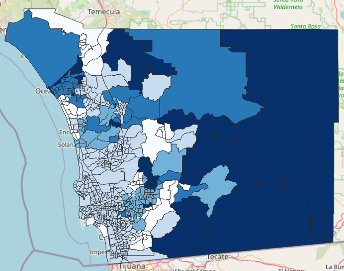
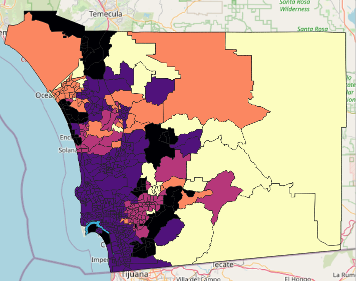
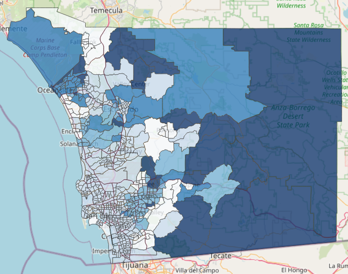
A new layer should appear called "Refactored." Double click this layer and go back to "Graduated." Now, when we click on the "Value" drop-down we should see the drinking water percentile. Click on it. Click on the "Color ramp" drop-down and select "Blues". There are other options such as magma and turbo that would not be ideal for our map and will be explained below. You can also refer back to the Theme section in the Misleading maps lesson to remind yourself.
Next, click on the "Mode" drop-down and select "Natural Breaks." We should now be able to see different value ranges as well as their specified color. This will be a helpful way to display and separate our data. Instead of using every single data point, the colors represent certain ranges of data. For example, the lighest colored regions include values from 9 to 20. The darkest colored regions include values from 61 to 95. Instead of different colors representing our data, we can associate the lighter blue areas with a less amount of contaminants found in drinking water compared to the darker areas. Refer back to the Classifying data lesson.
Click "Apply" then "OK." Also, notice below how the "Blues" option makes more sense here and is easier to visualize than another option such as magma. Now, we can uncheck the previous SDG Indicator... layer that we were using. You should now see something like this:
We can double click on the Refactored layer we are working on. Towards the bottom under "Layer Rendering" there is an Opacity bar. Change it by moving the slider or type in the box "75" to get 75%. Click "Apply" then "OK." We can also double click on each color under our open "Layers" and change each one individually to be 75% Opacity. This way of changing the opacity is better if you only want to change one or two of the colors, or if you want different opacity values. This will make it so we can see more of the OSM layer as seen below:
Next, right click the Refractored layer and go to "Export" and then "Save as Layer Definition File..." Click the 3 dots to the right of "File name" and select the save path. Next name the file and then click save. This should save as a .qlr file. This will save our layer with the changes we made.
Rasterize (vector to raster)
Note:
This next step is not necessary for our exercise as we don't need to rasterize our data. This just shows you how to display the data in the raster format.
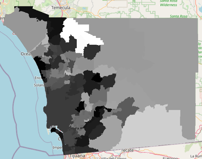
To rasterize the data, click on "Raster" at the top of the screen. Next, go to "Conversion" and then click on "Rasterize (Vector to Raster)..." Make sure that you have the correct vector "Input layer" that you want to rasterize. It should still be named "Refactored." For the "Field to use for burn-in value" choose "drinking_water_percentile." Next, change the "Output raster size units" to "Pixels," and the "Width" and "Height" to 1,000 and 1,000. Click "Run" and then "Close." Your water percentile data has now been rasterized. You should see something like this:
If you would like to save this, right click on the "Rasterized" layer, go to "Export" and click "Save As..." Click the 3 dots to the right of "File name." First select the correct path where you would like to save it. It should be saved in the folder for this exercise. Then name the file in "File name." Then, click "Save." You should notice that the file extension is ".tif." Also, at the top, the "Format" says "GeoTIFF." Remember from the Spatial data and its types lesson that this is correct. Finally, click "OK." You are now able to delete the temporary "Rasterized" layer, as you now have a new layer saved.
Which color ramp is better to use for our exercise?
Didn't get the correct answer?
Read the exercise again.